Games at their core are an artistic representation of their stories. Every minute detail, from the character design to the musical score, has been carefully thought out and has its own place as a factor in the feel for the universe. One such feature, that I hadn’t even thought about before my ventures into learning through games, is font. For myself and other English speakers we are spoiled with the luxury of 26 neat and distinct letters than remain clear across a wide variety of English fonts. Aside from the major oddities such as windings it’s rare than you would lose large amounts of clarity in English texts, regardless of how they’re written. Now, while I don’t believe that any chosen font was ever selected for the sole purpose of causing difficulties for the audience, in my time with this project I have seen a good handful of games that feature fonts that had me questioning whether the creator had even tried reading it themselves.
This is a bit of a can of worms that you can never really close the lid on again. Unless you come across a particularly cumbersome font you’d likely never really think about it. The vast majority of games out there have beautifully clear fonts laid across a clear background. In the mission of transmitting information, this is essentially the first and only requirement. However, in some situations you can come across writing styles that are… perhaps a little wobbly. The major questions that come to mind for me are; “How much of a headache is this going to cause me?”, “Is it worth me investing my time to familiarise myself with this?” and simply “Why though?”. These questions are further accentuated when a perfectly clear font and an overly stylized mess appear in the same game. If they can do it right once, why not twice?
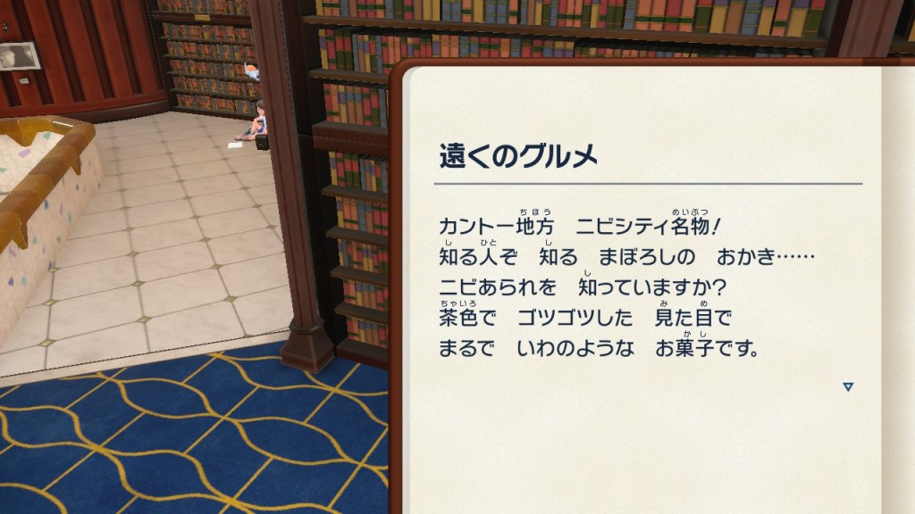
I will put on my forgiving hat for a moment and state that I am aware that there are reasons why certain situations may be hard to follow. Japanese in particularly uses an intricate and distinctly important writing style that can result in whole words or phrases meaning something else completely at the change of a brush stroke. In older games that feature lower resolutions you may find that there literally are not enough pixels available to show a kanji in full clarity. This is often overcome by an increased usage of more simplistic hiragana and katakana but for the most part, unless you were raised reading 80’s and 90’s pixelated Japanese, you would like struggle without a decent amount of practice. Another example of an item that may cause you vast amounts of eye strain is text size. Put simply, if a lot of text needs to be put into a small space, or if you are reading from a small screen, the writing is going to be difficult.
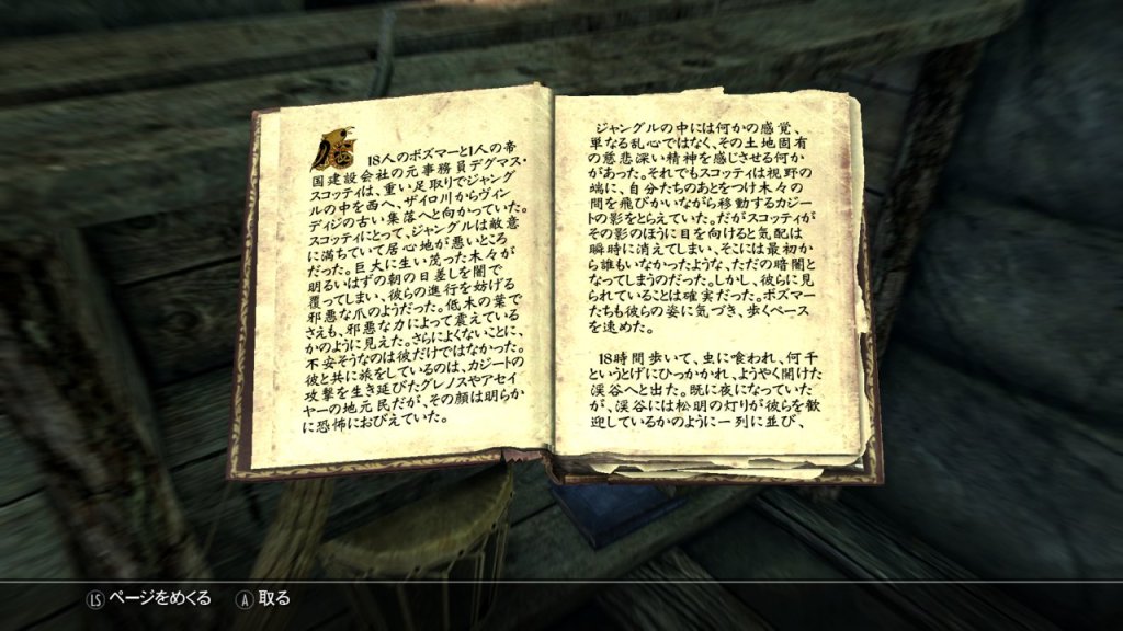
This is universal but accentuated again by difficult and similar kanji. If you couple this with a non-standard font like a handwritten note then prolonged reading can take you from effective learning to strong migraine before you know it. An example of this is Skyrim. Upon finding the books in Skyrim I wanted nothing more than to sit and read through them cover to cover but I was faced with miniscule (not impossible) lines and a great deal of content to digest. This was made even worse when it came to the notes found within chests or passed on by the courier as some of them were genuinely illegible. This truly spoiled my fun as it took me out of my immersion to struggle, especially considering I felt it was the fault of my reading ability and more the fault of the fact kanji looked like solid black squares.
My writing of this phenomenon of fonts was however brought about due to my most recent venture, whilst playing Doki Doki Literature club. Doki Doki is indescribably abundant in writing. From start to finish the characters are in constant discussion and almost every line is written in a clear, standardized font. Not only do you have text boxes and UI’s that are pleasant on the eye but you also have a log of everything you’ve read so far that you can scroll through at your own leisure. At no point did I find any trouble or grief in reading (except perhaps the subject matter of the story itself: spoilers, it’s harrowing) but then, out of the blue, I had to read the poems.
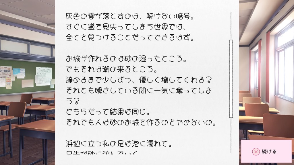
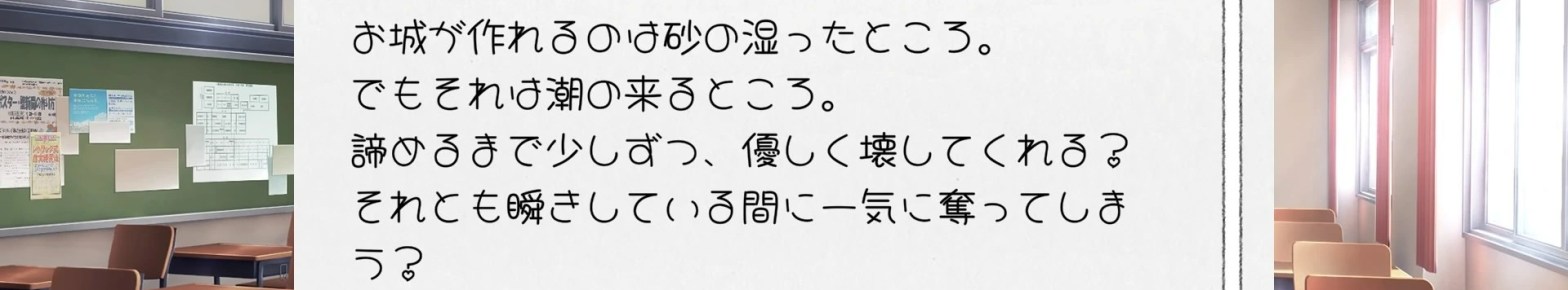
Doki Doki is the prime culprit for having clear writing alongside a monstrosity. The poems are the titular stars of the show for Doki Doki and yet they feature a font which, for the longest time, had me wondering what made them consider this. Handwriting in games isn’t a rarity but this was the first time I had come across a font where I had to stop and work out even which hiragana was being used. I think it was actually worse because it was on the cusp of being easy to follow but I was thrown for a loop when words didn’t end how I thought they should. “Was that a は or a す?”. “Why is this kanji all round and bubbly?”. “And why do all 4 of these vastly different girls have exactly the same awful handwriting?”.
In time it became more familiar but I hated the sight of these pages. Looking back at this now there are parts of me that feel that this anger may have been unwarranted but I fail to comprehend why a clearer font wasn’t chosen. It also makes me question if it’s just me that feels this way and perhaps a Japanese audience is more familiar with this and therefore able to digest it at a natural reading speed. All valid questions but distracting and detracting from the task at hand. I feel that in the pursuit of learning language, the more tedium that is placed in the way of simply reading and taking in content, the more likely you are to unfocus and press on, especially when the content to follow is beautifully clear and arguably more useful.
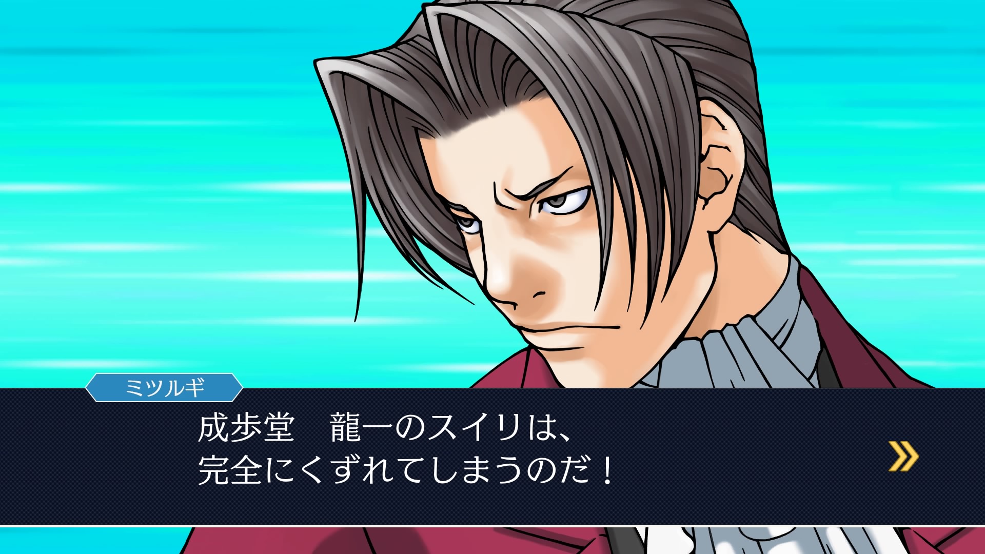
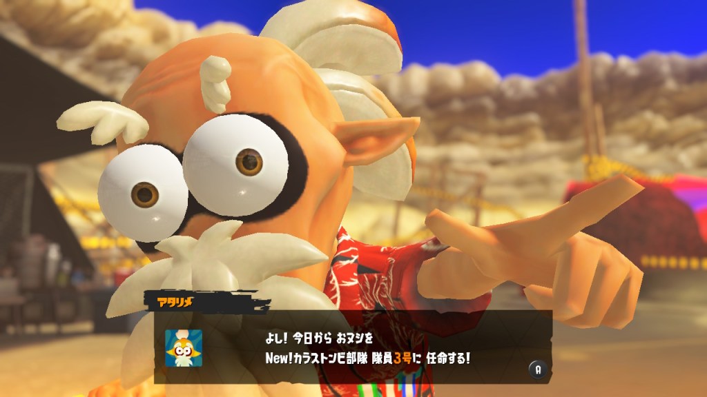
Arguments could be made that increasing the variety of writing styles in your repertoire can’t be a bad thing. I’m happy to agree with the for the most part. Certain fonts like the above “Capcom font” have their struggles but are much more prevalent and therefore feel more worth investing your time into them. Other more difficult fonts, such as feudal Japanese calligraphy, add immense amounts of character to their respective games and can be forgiven for their ambiguity as long as reading it isn’t necessary to understand the story.
The lessons that I hope has come across in this little rant is that not all games are made equal, you will find that even the best of games uses horrendous stylistic choices, but it is down to you (and me if you ever want any help or tips) to break down the problem in front of you and establish it’s value for future use. If you play a lot of 8-bit games then take the time to recognise lower resolution kanji. If you play a game regularly that features an irregular font, stop and focus on each character in order to benefit from the content throughout your playthrough. And if you find something too awful to read in a game you don’t really like anyway then perhaps skipping it and moving on to something more comfortable isn’t a bad choice.
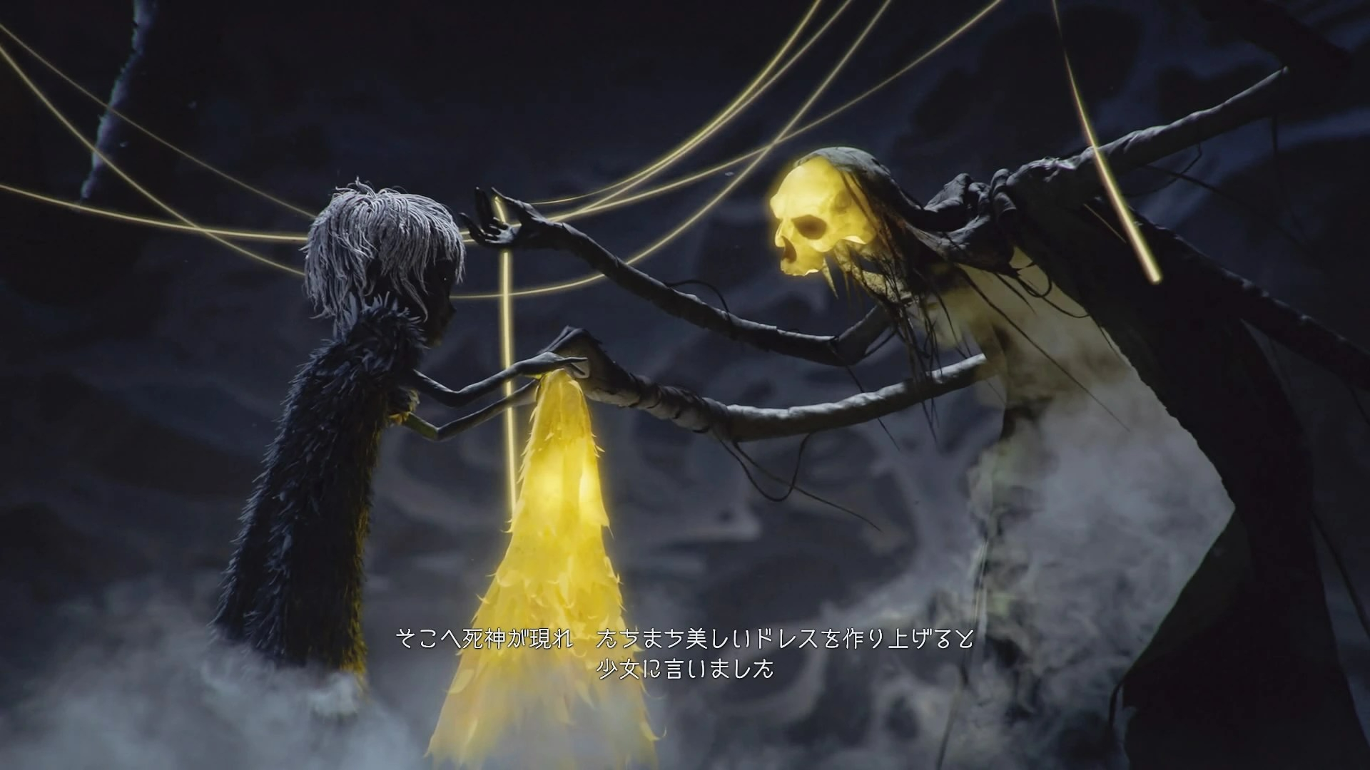
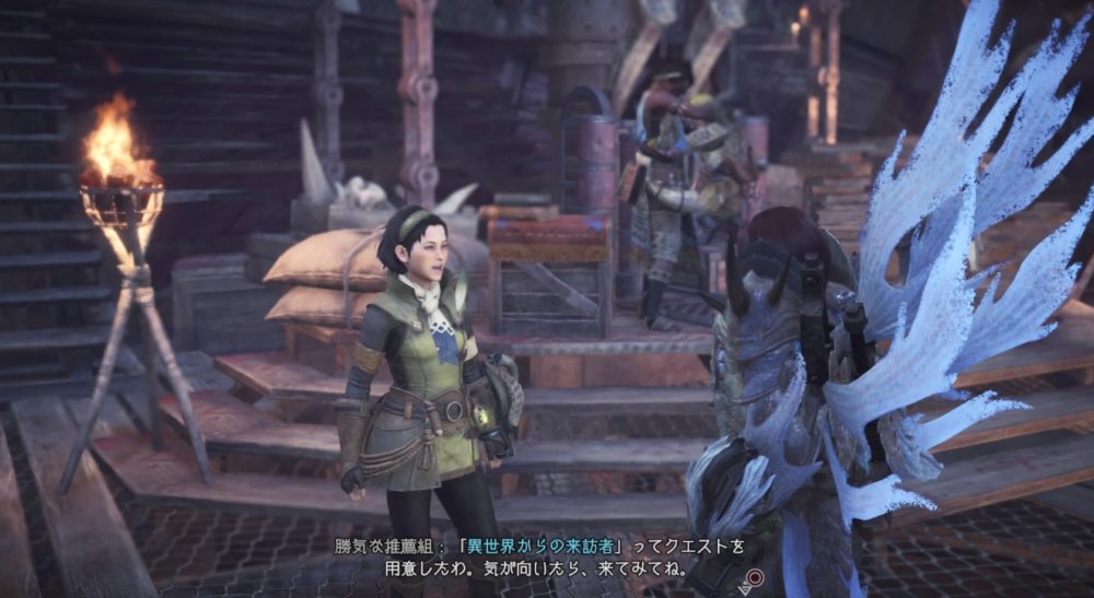
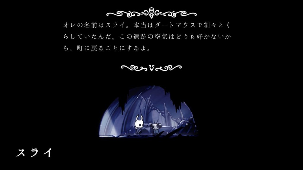
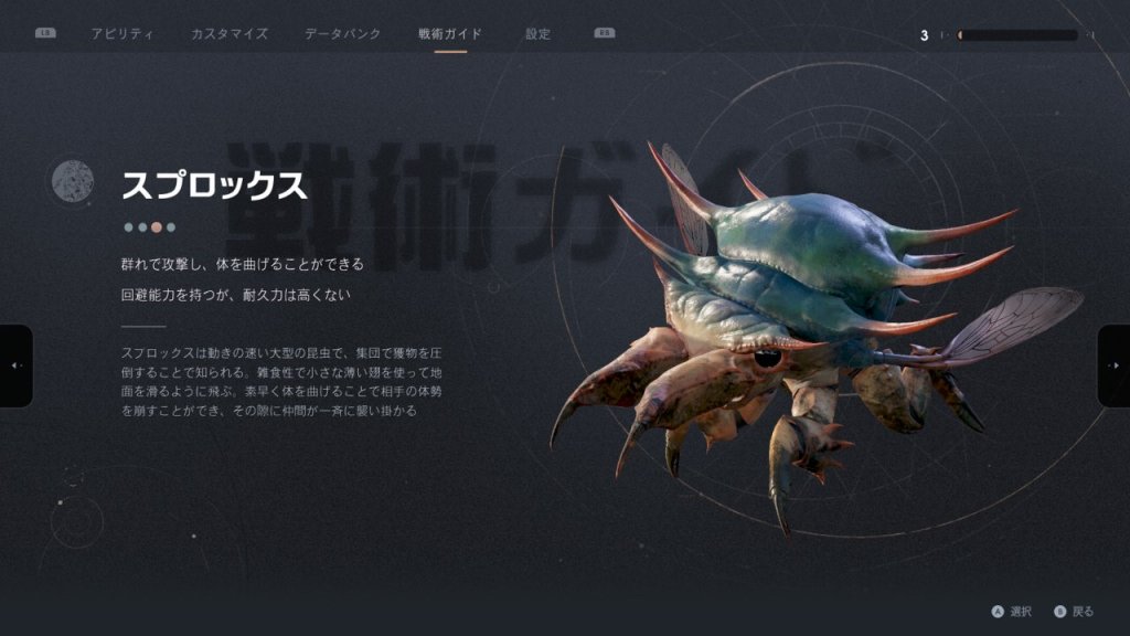
Gallery

One thought on “Dealing with fonts in gaming”